PRISMA - Mobile UI Kit for Adobe XD
- Ui Templates/Adobe Xd
- (0)
- Sales: (12)

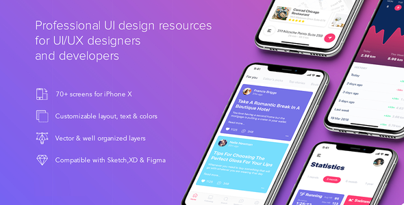
Prisma UI Kit is a huge mobile screens and components with trendy design that you can use for inspiration for your app with super quality design. The kit includes 70+ design elements vector based and 7 categories: Login – Signup, Walkthrough, Navigations, Profiles, Articles, Statistics, Maps – Tracking. Each screen and component is made carefully and easily customized for any project. Buy it now and share with friends this awesome toolkit !
Features
Pages Included
Source & Credits
Fonts: SF UI Display
Image: Unsplash Icon: Flaticon
How to Use Adobe XD Files
Add or Replace Images: Select the Layers Group section of Artboard, double click on the Layer with Mask name, and you can adjust on the right side by clicking “Select Image”. You can also edit any text, color or any font file by double click and change the same.
Note
All images are just used for preview purpose only and replaced with Placeholder Images. They are not part of the template and not included in the final purchase files.
Please don’t forget to rate this item if you like it.
Better Safe than sorry:)
Get help when you need it most and extend support for 6 more months
Save % by extending now instead of after support has expired.
